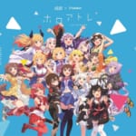
キズナアイらが参加するバーチャルタレント支援プロジェクト「upd8」を運営するActiv8株式会社は、本日2019年14日(金)よりコーポレートロゴおよびコーポレートサイトを一新しました。
■コーポレートブランドアップデートについて ー代表取締役 大坂武史 コメントー
Activ8のミッションは「生きる世界の選択肢を増やす」です。バーチャルに形成される仮想世界は、人が「生きる」ために必要なコミュニティを形成し、経済活動が成立する「生きる世界」になり得ると信じています。
そしてバーチャルタレントは仮想世界の成立を加速させ、マルチワールド時代到来の鍵を握っています。
わたしたちActiv8は、これまでに引き続きIPプロデュースやマネジメントをはじめ、upd8を中心としたバーチャルタレントネットワークの構築、関連するプロジェクト開発の強化に尽力するとともに、創業から4年目を迎えるにあたってはバーチャルタレントならではの価値を発揮できるxR技術の活用・実用化や、中国・北米などグローバルでの活動体制構築を加速させます。
それらはタレントをスターへと押し上げるユーザーの期待を超えた体験(コンテンツ)を創造する環境となります。まさにマルチワールド時代におけるハリウッドのような、スタータレント創出のエコシステムになり得ると考えています。
2016年9月の創業からまもなく丸3年が経過しようとしている今、幸運にも到来したVTuberブームの恩恵を受けつつ、創業当時から見すえていたVirtual Beingや仮想世界という大きな時代の潮流(ムーブメント)を推進すべく、決意を新たにコーポレートブランドのアップデートを行いました。
ロゴやコーポレートサイトには、自分も、世界も「(私たちは)何者にでもなれる」「(次元を)超越できる」といった「人生は自らの意志で選択できる」という願いが込められています。
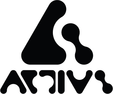
ロゴは創業メンバーも大きく影響を受けている『攻殻機動隊 STAND ALONE COMPLEX』(S.A.C.)で、笑い男マーク(The Laughing Man)などのデザインをされたポール・ニコルソンのデザインです。
Activ8はこれからもテクノロジー発展がもたらす、マルチワールド実現を牽引すべく自らをアップデートしていきます。応援よろしくお願いいたします。
■ロゴデザインについて ーデザイナー ポール・ニコルソン コメントー

My love of technology, futurism, science fiction, and anime goes back to childhood so to work on the Activ8 logo design was to coalesce lifelong passions into one project.テンションが上がるようなプロジェクトが時折入ってきます。
私のテクノロジー、フューチャリズム、SFとアニメの愛は子供の頃までさかのぼります。
なので、Activ8のロゴデザインを作る時、人生でパッションを持っているものを全部入れ込むことができました。
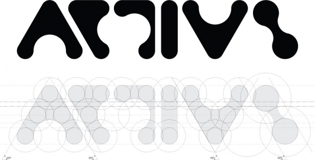
The first step I take with any logo design project is to look at the word itself.
Every word has a unique pattern and combination of shapes related to the letters that make up that word.
In the case of Activ8, the way the ‘C’ sits next to the ‘A’ to its left and the ‘T’ to its right and so on for all the other letters.
The word Activ8 is made of shapes that are either positive, the letters, and negative, the spaces in between.
By looking at the positive shapes made by the letters and the negative spaces, I look for ways by which the letters can fit and flow into each other.
ロゴを作る上で必ずやることは、その言葉自体を見ることです。
全ての言葉はユニークなパターンとユニークな形で作られています。
Activ8の場合、Cの左にAがあって、右にTが入っててその全ての字のとなりにアルファベットが並んでいます。
Activ8の文字はポジティブの形で、その間のスペースがネガティブの形になっています。
ポジティブとネガティブの形を見て、どういう風にフィットしてフローさせるかを考えました。
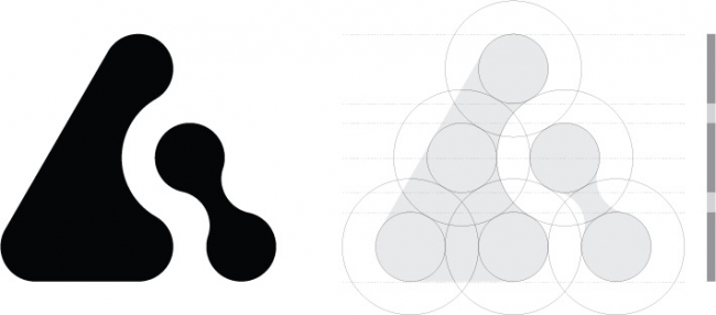
The Activ8 design is made up of two elements – the A8 Logo and the Activ8 Logotype.
With the A8 logo I have employed the use of positive and negative spaces,the letter ‘A’ being a triangle (positive), with the number ‘8’ being cut out from the triangle (negative).
I am a firm believer in the adage ‘less is more’, the notion that simplicity and clarity lead to good design.
There is a purity in this design by its simplicity.
The A8 logo is an equilateral triangle made up of 6 circles stacked from top to bottom in a 1, 2, 3, layout.
Each circle has an outline that touches the adjacent circle with the number ‘8’ created by utilising the outlines from the middle and bottom right circles.
Activ8のデザインは二つのエレメントで作られている- A8ロゴとActiv8のロゴタイプ。
A8のロゴはポジティブとネガティブの形を利用しました。
Aは三角(ポジティブ)そして8は三角から切り取ってる(ネガティブ)。
私は “Less is more”「より少ないことはより多いことだ」ということわざの信者です。
このロゴはデザインのシンプルさによって明快さを表現しています。
A8のロゴは正三角形で1,2,3のレイアウトで下から上まで6個の丸で作らています。
一つ一つの丸にアウトラインが囲っていて、同一線上の丸が触れ合っています。そこで全ての方向から8の文字を形成しています。
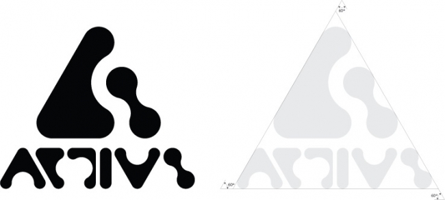
The Activ8 logotype is centrally located beneath the A8 logo.
Stacked together, they also form an equilateral triangle.
The characters that make up the Activ8 logotype employ the same stacked circle’s framework used in the A8 logo.
By employing this framework, each character and the word as a whole, has taken on a unique and intriguingly abstracted form.
Activ8のロゴタイプはA8のロゴの下に配置されています。
重ね合わせるとここでも正三角形になります。
Activ8のロゴタイプの文字はA8のロゴと同じ丸のフレームワークで作られています。
このフレームワークを活かして、各文字と言葉全体がユニークで抽象的な形を作りあげているのです。
プロフィール
Paul Nicholson(ポール・ニコルソン)
Based in London, Paul Nicholson,who founded and ran two successful ventures; a specialist design/print company, PROTOTYPE 21 and fashion brand, TERRATAG, is now NUMBER 3.
With over 25 years experience, in 2015 he began working as an independent graphic designer, art director and artist.
Specialising in creating unique, distinctive logo designs, typography and graphic art,he continually experiments, exploring and defining visual pop language at it’s best.
An innovative mind, working towards a creative vision, his forward-looking and progressive graphic style cannot be ignored; inventive, bold artwork with a dynamic sense of colour that is a hybrid and distortion of pop culture, technology, sci-fi, and futurism.
ロンドンに拠点を置き、2つのベンチャーの設立と運営(デザインと印刷をメインとしたPROTOTYPE21とファッションブランドTERRTAG)を経て、現在はNUMBER3という会社を設立。
2015年、25年以上の経験を元に個人でグラフィックデザイナー、アートディレクター、アーティストとして活動を開始。
彼の特色は、ユニークで独特なロゴデザイン、タイポグラフィ、グラフィックアートの創作であり、常に「ビジュアルポップ・ランゲージ」という概念の研究、定義、探求し続けていることです。
創造的なビジョンに向けて取り組む革新的なマインドや、前向きでプログレッシブなグラフィックスタイル、すなわち<テクノロジー><ポップカルチャー><SF><未来>というカテゴリの融合とそのゆがみを表現した彼のダイナミックな配色センスが生む独創的な太字のアートワーク、からは目が離せません。
■新コーポレートサイトについて
■関連リンク
upd8公式WEBサイト
https://upd8.jp/
upd8公式Twitter
https://twitter.com/project_upd8